Vibe Lash Co.
Programs: Adobe Illustrator, Adobe Photoshop, Adobe InDesign
Project: Vibe Lash Co.
Purpose: Identity Rebrand
Year: 2022
Goals and Objectives
This project explored branding and identity systems, encompassing design and management through redesigning an established brand. I researched the company’s objectives and target audience to create a compelling brand, emphasizing content hierarchy, typography, image integration, and color.
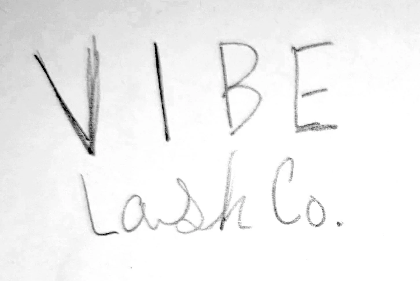
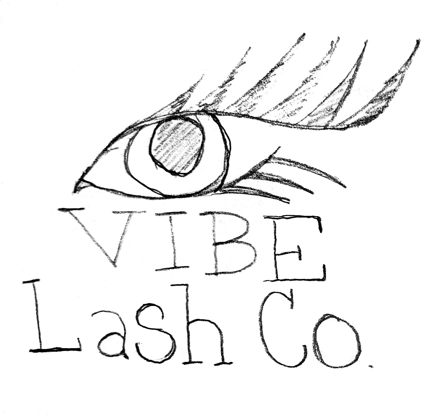
Old Logo
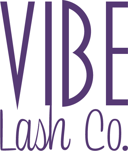
New Logo
The previous logo is forgettable and fails to represent the brand or connect with the intended audience. The new logo incorporates iconography to produce an engaging and unforgettable image that can foster a relationship with potential clients.
Research + Planning
Brand Mission Statement
Our mission at Vibe Lash Co. is to create a serene and safe space where our clients can feel pampered and beautiful. We strive to achieve this by enhancing their natural lashes, thereby boosting their self-confidence. Our commitment to providing a secure and comfortable environment ensures that every client feels valued and cared for.
Brand Core Values
Trust
Passion
Innovation
Transparency
Customer Commitment
Self-Improvement
Target Demographic Personas

Sarah Thompson
Age: 30
Occupation: Marketing Manager
Education: BA in Business Administration
Income: $70,000 per year
Marital Status: Married
Meet Sarah, a marketing manager in her early thirties who values maintaining a polished appearance. With a demanding job that involves frequent client interaction, Sarah recognizes the significance of making a lasting impression. Despite her busy schedule, she prioritizes self-care and beauty treatments. Sarah is happily married and loves to spend her leisure time exploring new restaurants and traveling with her spouse.

Jessica Ramirez
Age: 25
Occupation: Freelance Graphic Designer
Education: AAS in Graphic Design
Income: $55,000 per year
Marital Status: Single
Introducing Jessica, a talented graphic designer in her mid-twenties who has a deep passion for creativity. She prioritizes both personal and professional growth and allocates her moderate income towards these pursuits. During her free time, this independent woman enjoys socializing with friends, attending art exhibitions, and exploring new hobbies.
Design Process
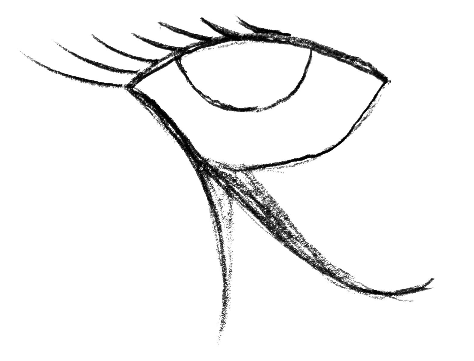
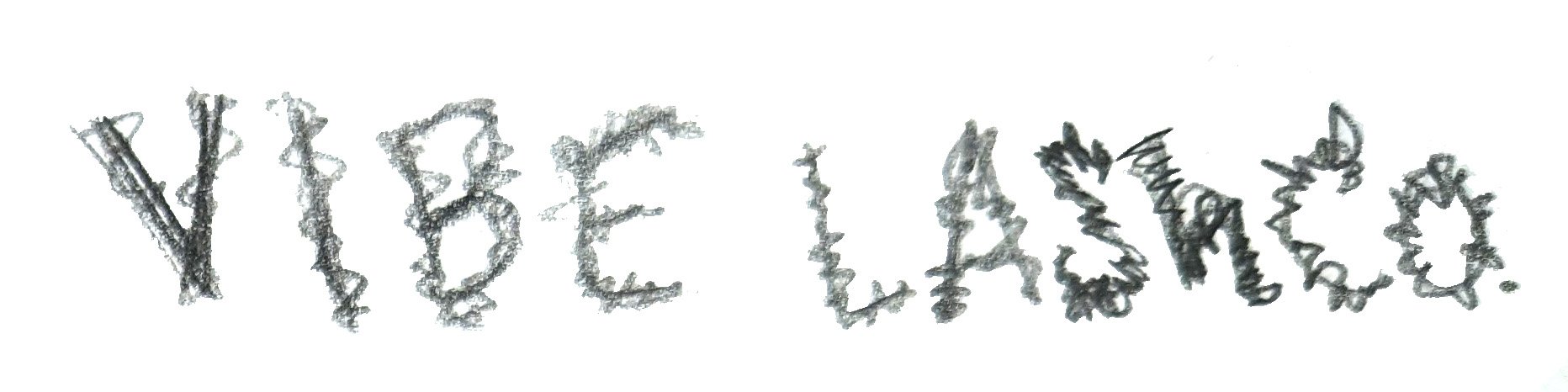
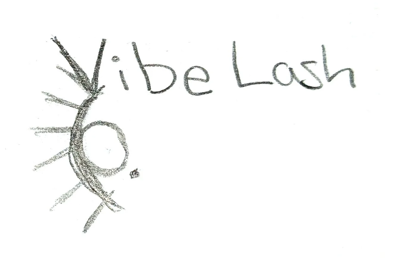
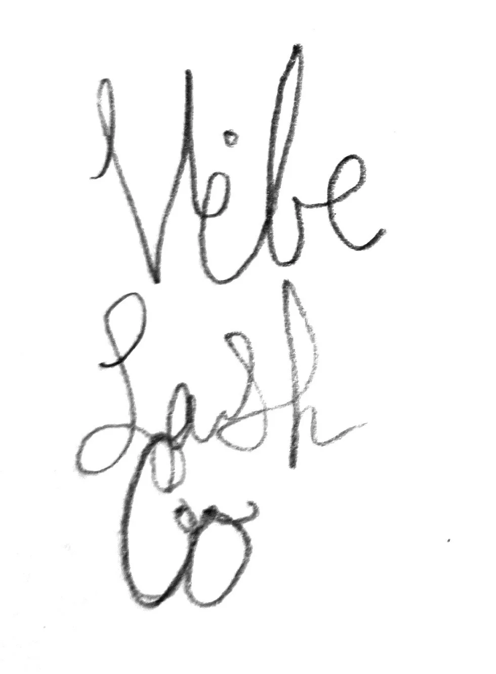
Sketches
I began sketching concepts on paper to design the logo for Vibe Lash Co. I aimed to incorporate eyelashes, the brand’s central theme. To accomplish this, I drew inspiration from Egyptian hieroglyphs and the Eye of Horus, which symbolize safeguarding, wellness, and rejuvenation. Plus, I referred to distinguished fashion and beauty companies for identifiable wordmarks.

Typography
The typography chosen is sleek and contemporary, taking inspiration from luxury fashion brands. Blakely font is used for a sophisticated touch in the logo, while Avinao Serif adds a bold statement to the headings. For lower hierarchy paragraph text, Century Gothic Pro is utilized.
Aviano Serif
Bold


Blakely
Light
Century Gothic Pro
Regular
Color Swatches
The brand uses Dark Lavender as its primary color, exuding mystery and elegance. Beige accents add sophistication, while a darker shade of purple creates depth. This harmonious trio embodies the brand’s essence and enhances the customer experience.
RGB 57, 02, 64
CMYK 15, 19, 36, 51
HEX #390240
RGB 86, 57, 115
CMYK 78, 90, 25, 11
HEX #563973
RGB 217, 199, 167
CMYK 15, 19, 36, 0
HEX #d9c7a7
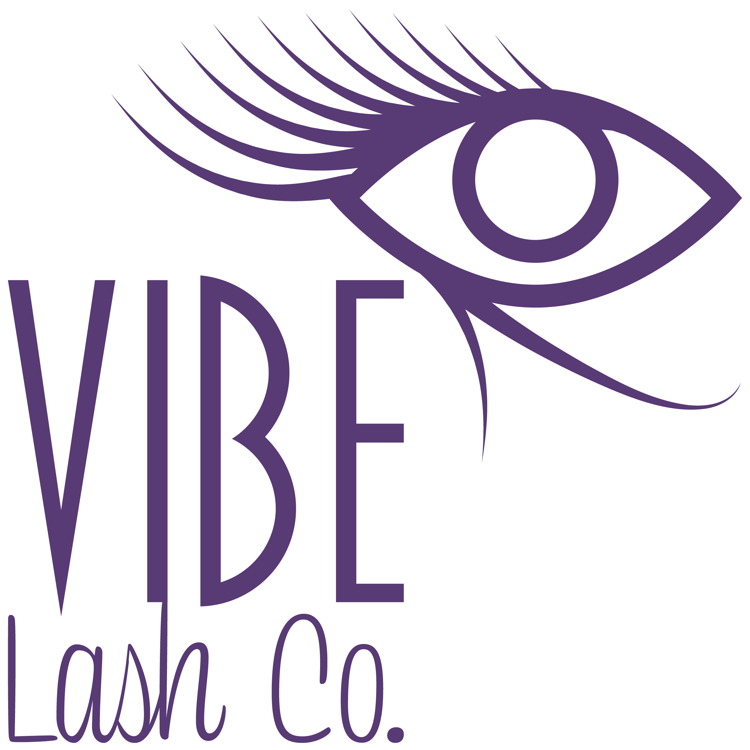
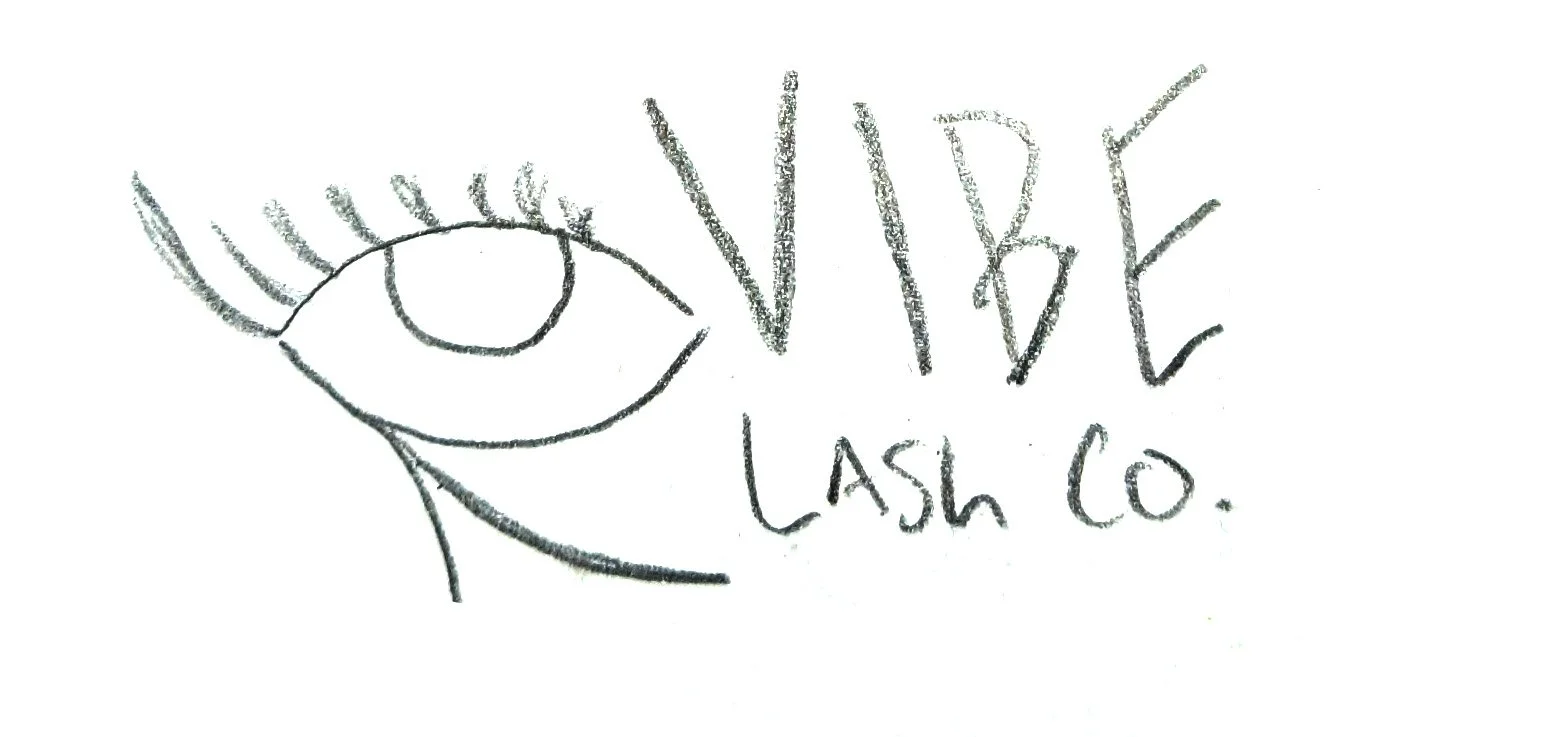
New Logo
The updated logo expands on the concept of rejuvenation and wellness conveyed by the Eye of Horus. It maintains the hieroglyphic shape while incorporating long eyelashes. The typography lends a contemporary feel with a hint of elegance.
Logo Variations

Logo Lockups
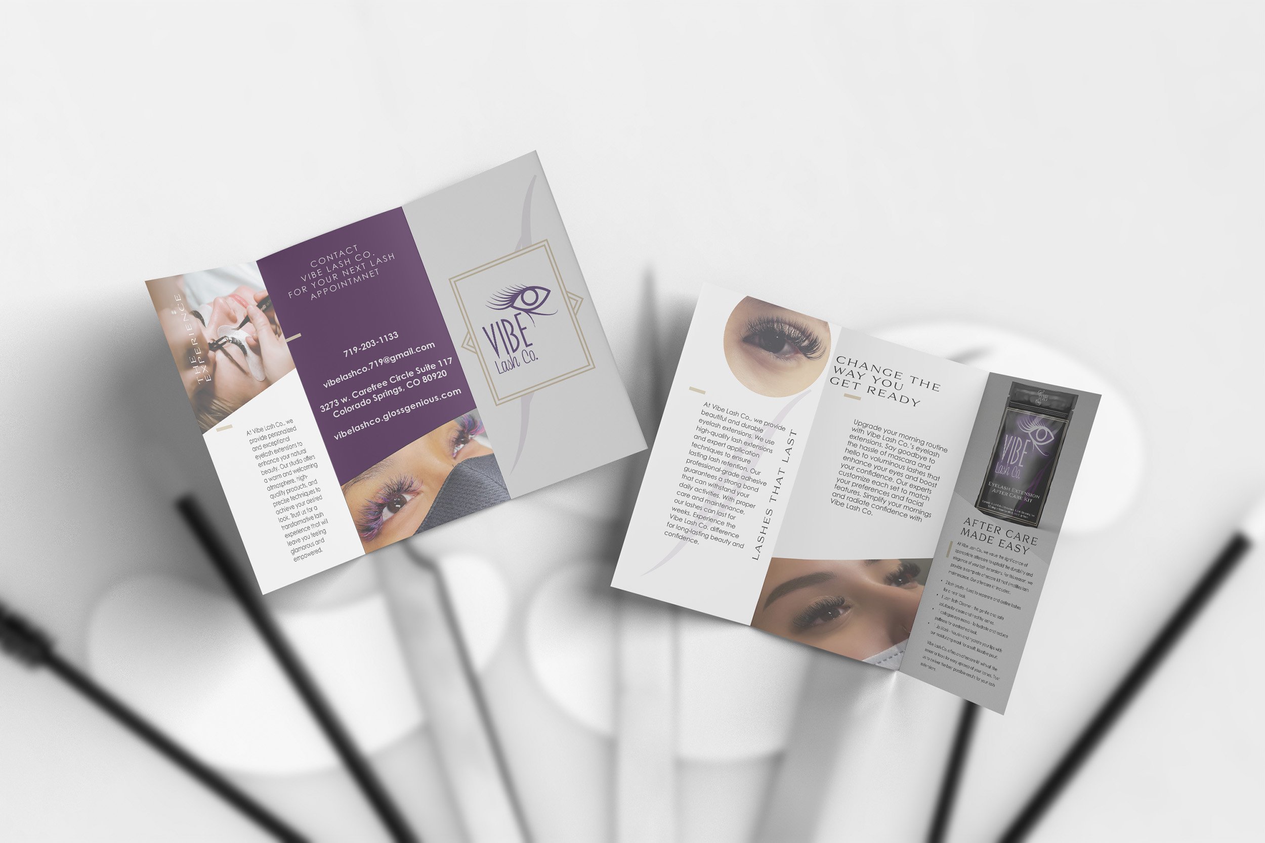
Printed Materials
The printed materials add to the high-end look and provide good customer service. These include a business or loyalty card, a letterhead for official letters, an After Care card with important customer info, and a brochure showing our products and services.

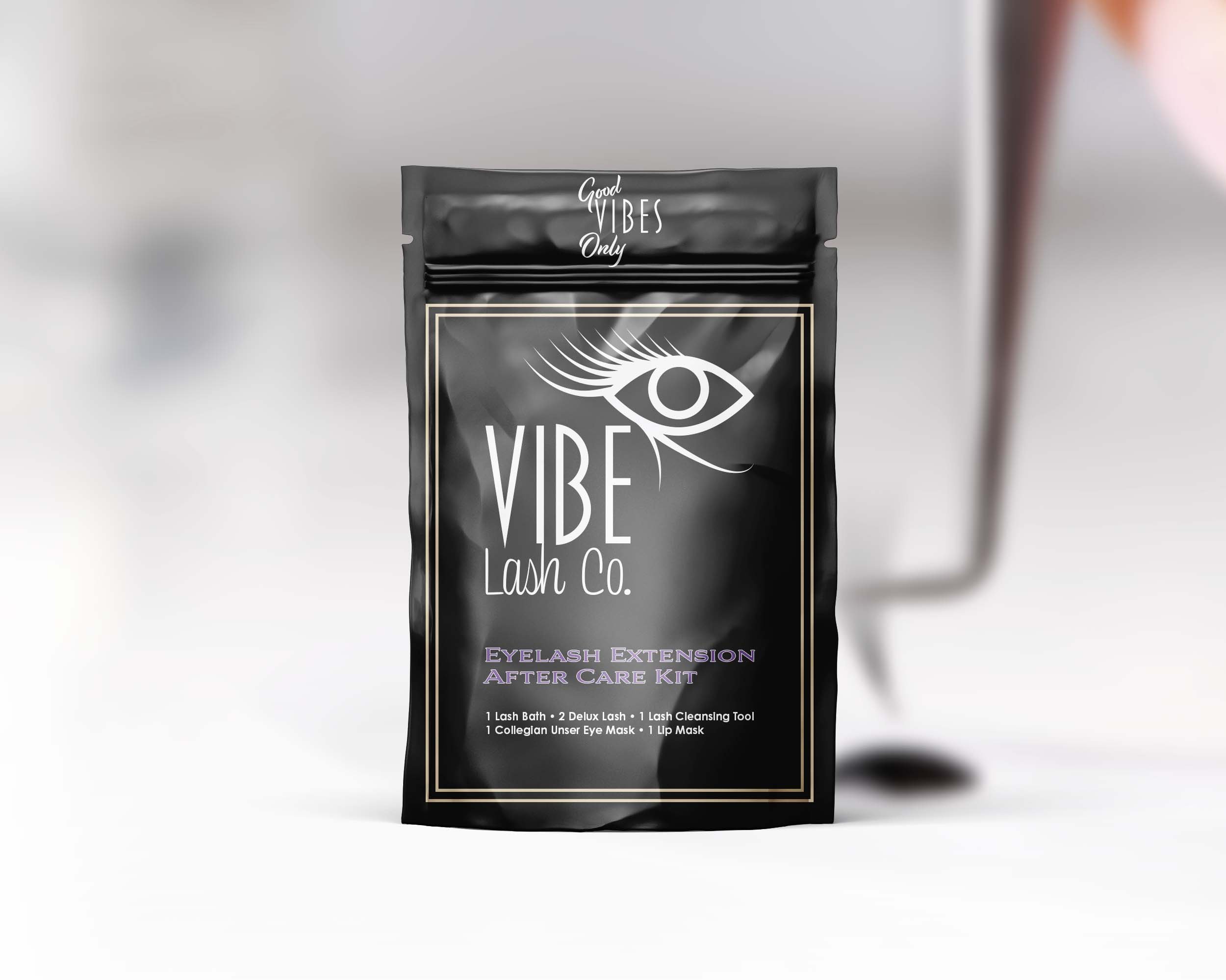
Brand Packaging
The package design features a bottle and bag combo with a negative lockup design set against a black background. The challenge was maintaining the brand’s sophistication and upscale look while keeping packaging expenses low.

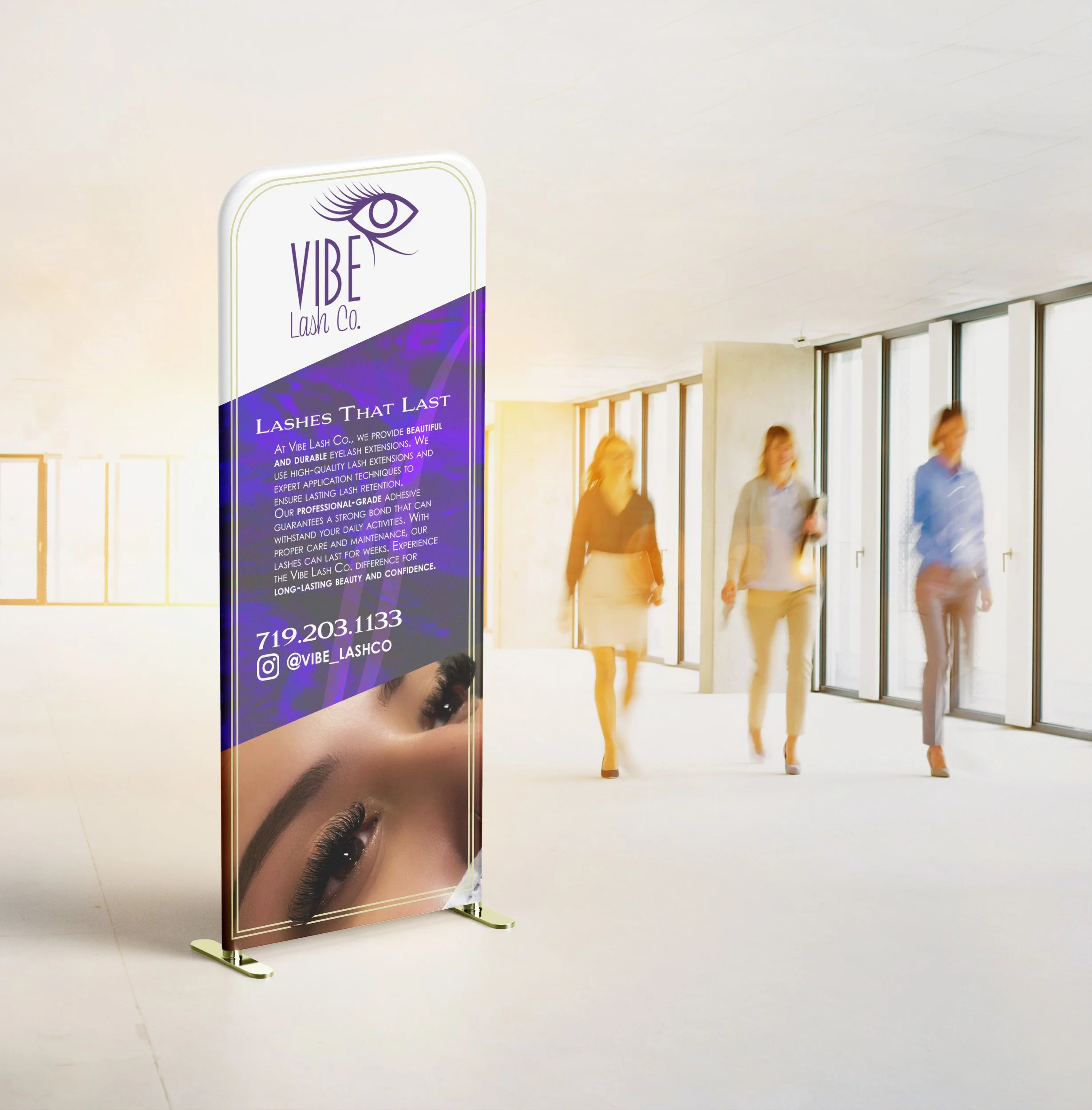
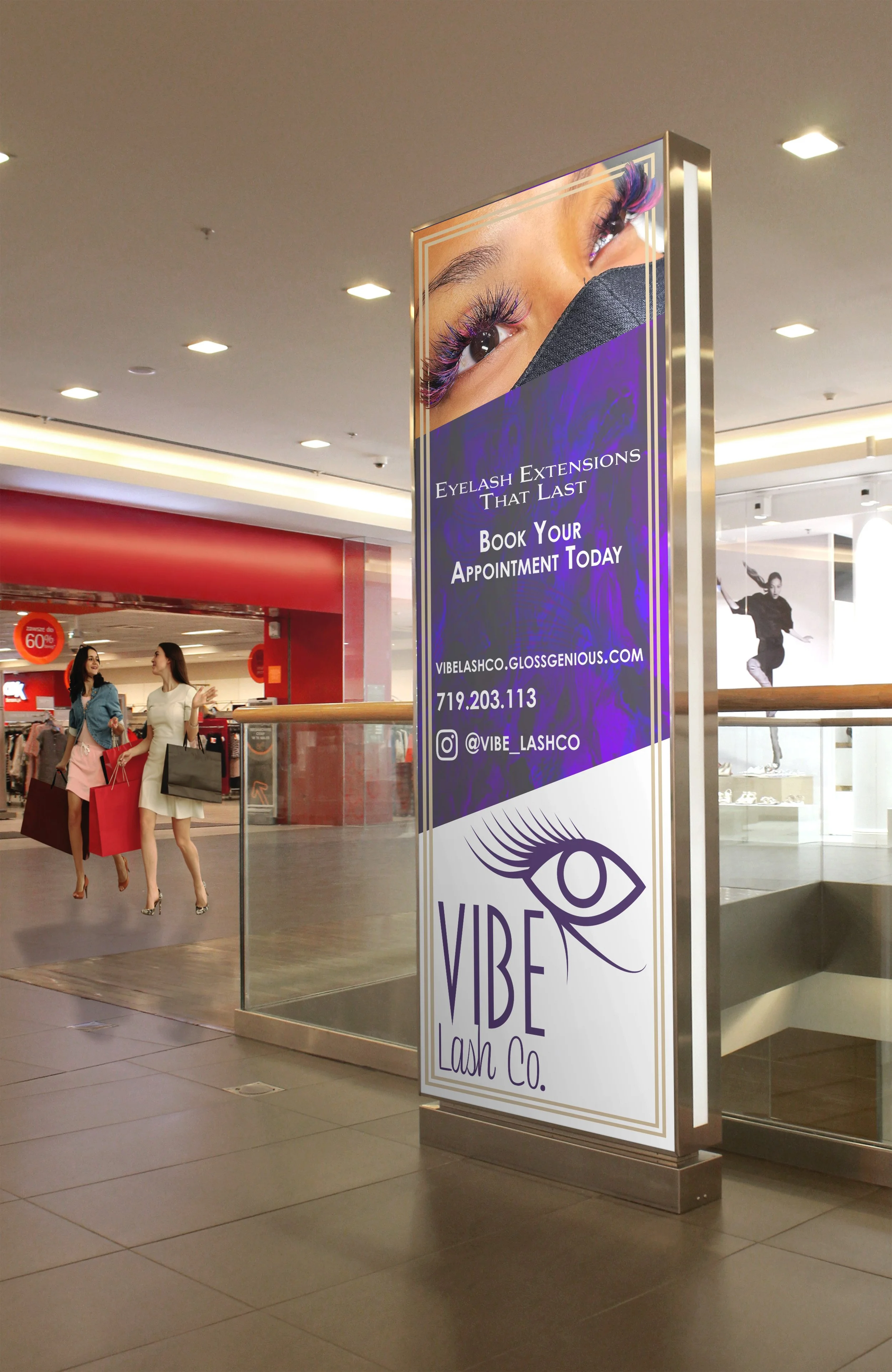
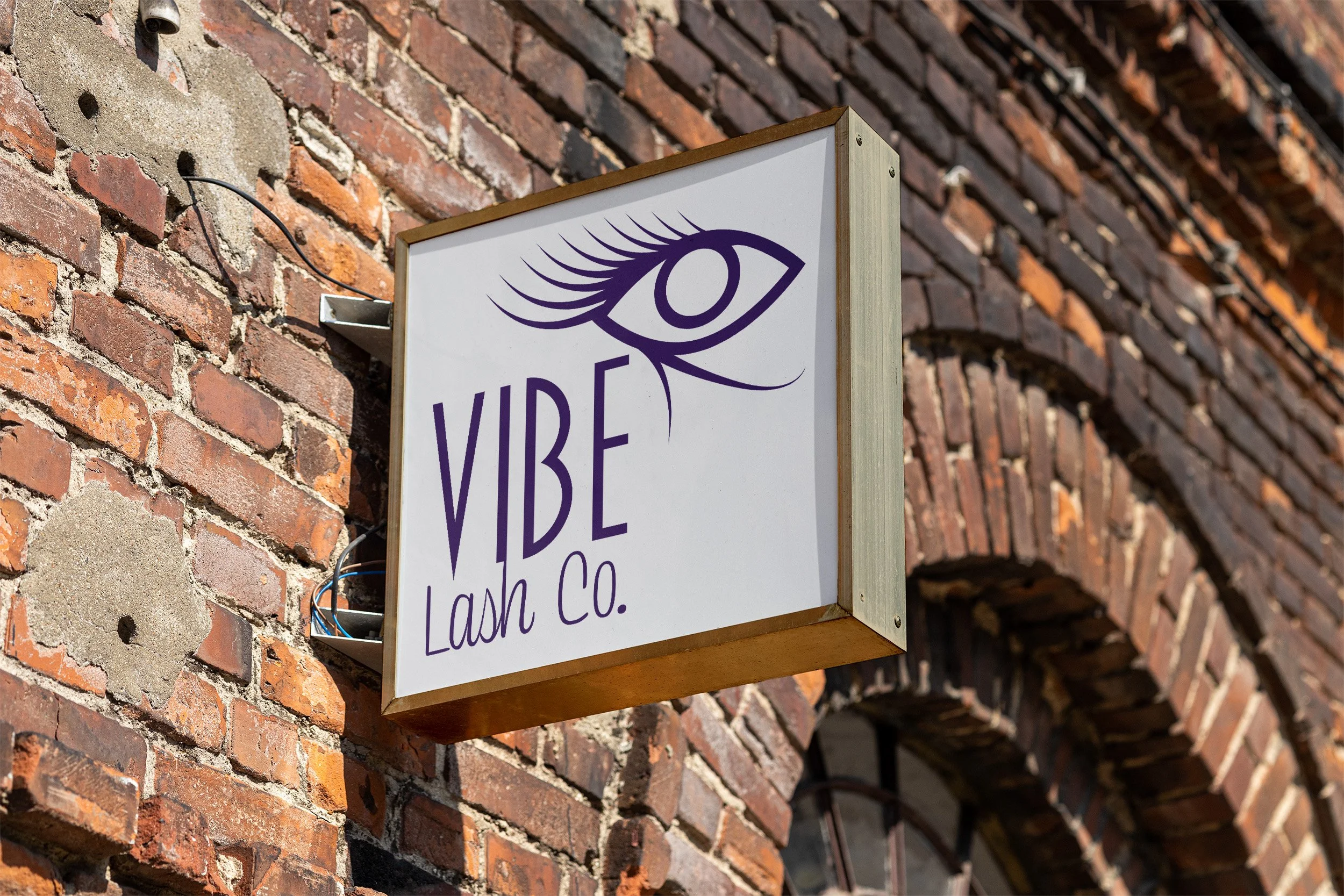
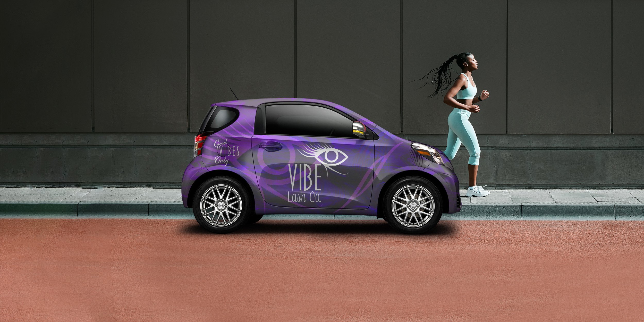
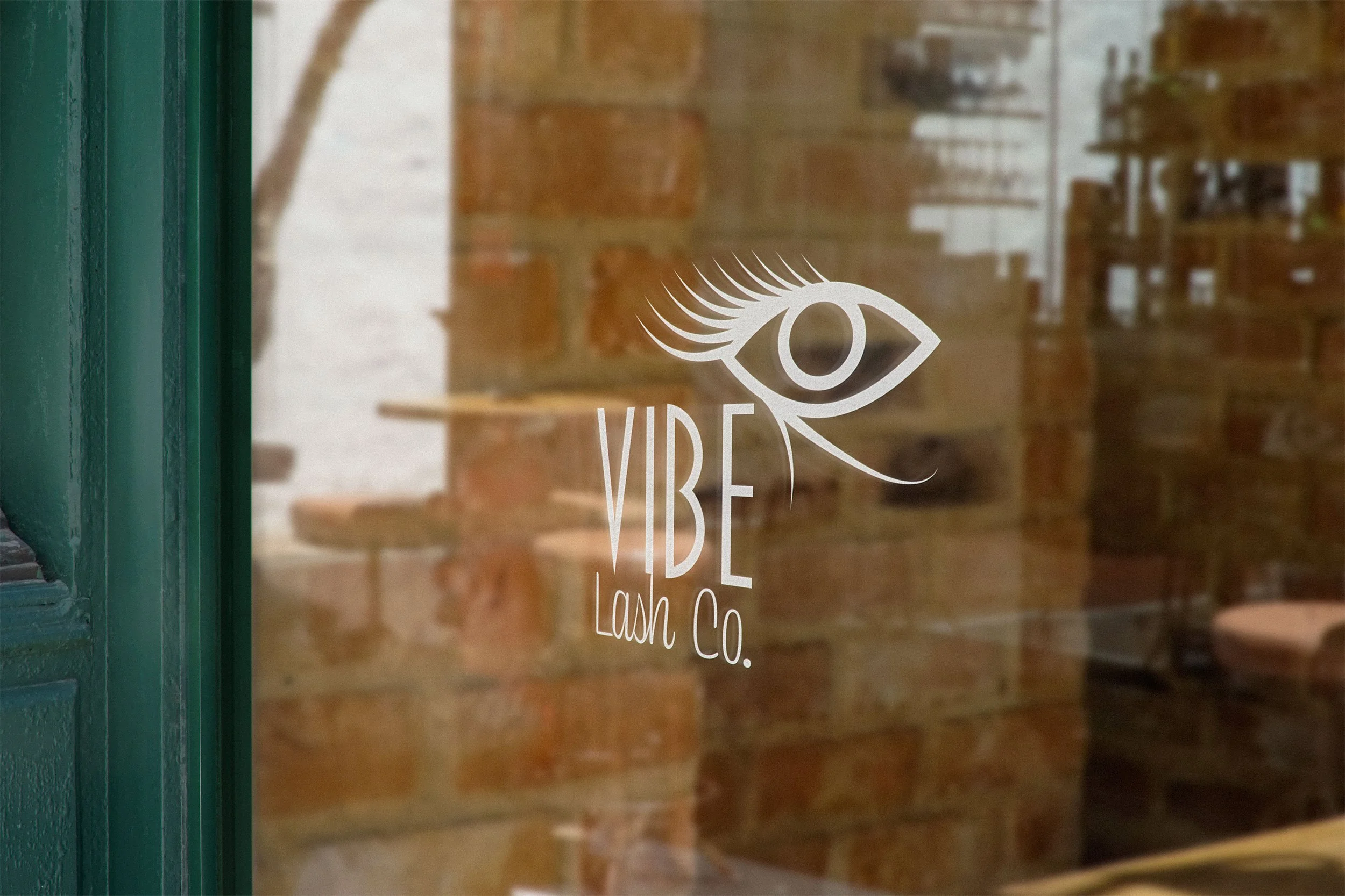
Environmental Contact
The brand gains visibility through environmental elements that bring it to the public’s attention. Marketing advertisements showcase the services, while signage and vehicle wraps help create brand awareness and validation.