Peak Adventure Days
Programs: Adobe Illustrator, Adobe Photoshop, InDesign
Project: Customer Appreciation Program
Purpose: Branding and advertisement
Year: 2022
Goals and Objective
Peak Adventure Days is a customer appreciation program offered by the 21 Force Support Squadron. This project aims to create branding that can be used in advertising posters to raise awareness of the program and encourage more people to participate.
Research + Planning
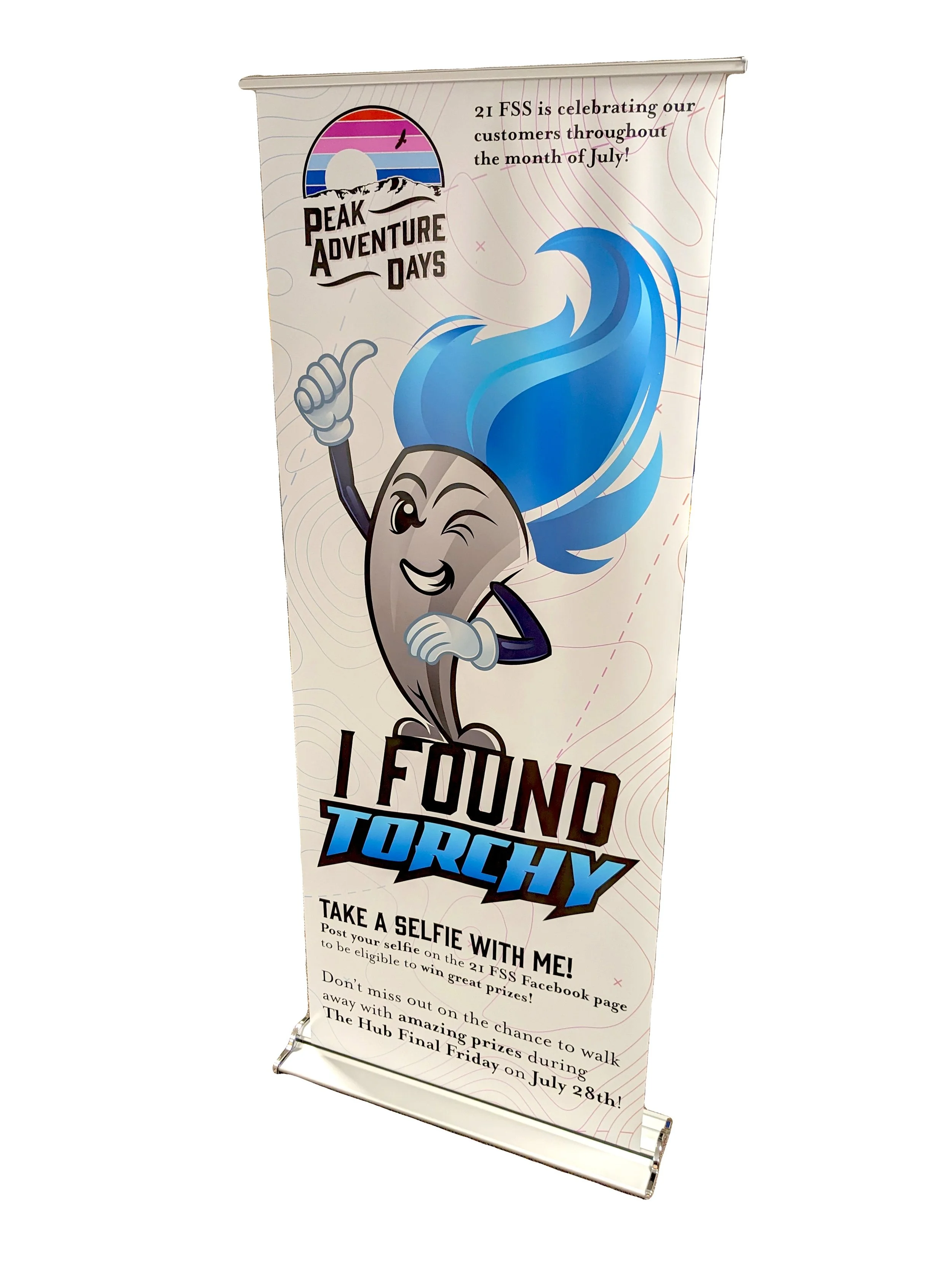
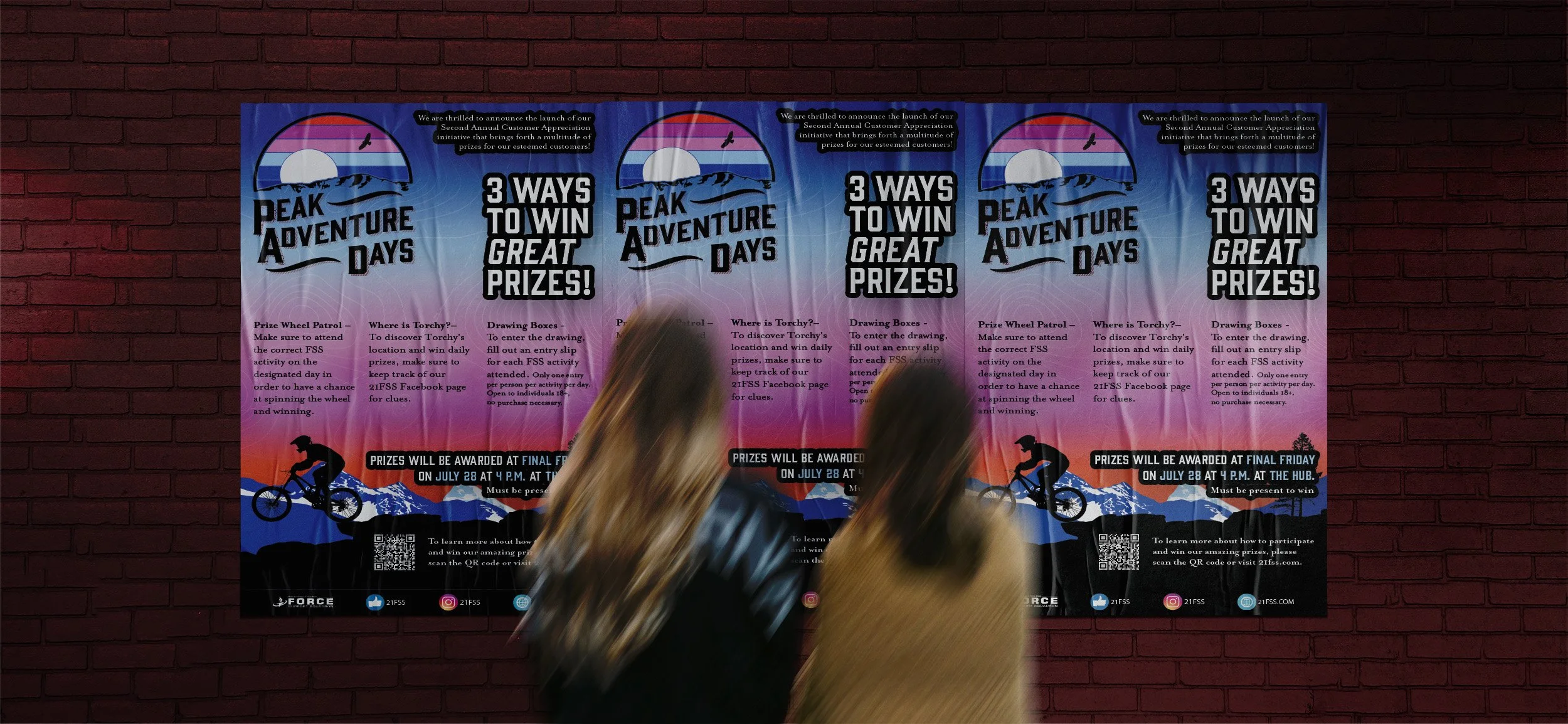
Peak Adventure Days aims to motivate people to participate in outdoor activities. In the first year, the program offered an ATV as the grand prize. In the second year, prizes included a mountain bike, stand-up paddle board, and kayak. During my research, I decided to create a vintage and colorful aesthetic with a natural theme.
Design Process
Typography

Mrs Eaves OT
Roman

Color Swatches
RGB 175, 210, 239
CMYK 29, 8, 0, 0
HEX #AFD2EF
RGB 53, 95, 172
CMYK 86, 67, 0, 0
HEX #355FAC
RGB 43, 67, 155
CMYK 96, 87, 0, 0
HEX #2B439B
RGB 0, 0, 0
CMYK 74, 68, 67, 90
HEX #000000
RGB 186, 93, 164
CMYK 27, 77, 0, 0
HEX #BA5DA4
RGB 215, 143, 190
CMYK 12, 52, 0, 0
HEX #D78FBE
Choosing suitable typefaces is crucial for an outdoor aesthetic poster. Gin and Mrs Eaves are a perfect match due to their organic, flowing forms that blend seamlessly. They strike a balance with their contrasting styles, offer excellent legibility, and create an emotional connection that enhances the overall impact of the poster.
I planned to capture the stunning Colorado sunset for my project. I carefully chose a range of colors that gradually transitioned from gentle sky blue to captivating shades of deep purples and maroon. To make it even more attractive, I added a bright orange hue to create a striking contrast with the blues and to mirror the color of the rocks in the Garden of the Gods in Colorado Springs.
RGB 229, 84, 60
CMYK 4, 82, 82, 0
HEX #E5543C
RGB 122, 35, 45
CMYK 32, 92, 75, 38
HEX #7A232D
Gin
Regular
Logo Design
The stripes create a gradient of colors, ranging from deep blues to natural orange. The mountain graphic is designed to resemble Pikes Peak, the mountain that overlooks Colorado Springs. The curved text eliminates any awkward rectangular shapes in the negative space that would have been present if it had been straight. The drop cap is added to capture the viewer's attention.

Environmental Contact
The program is being advertised at Peterson Space Force Base through posters and video displays located throughout the facilities with the plate number "1". There are two variations of the advertisement, one in a horizontal orientation and the other in a vertical orientation. To further promote and support the program, we have created a branded spin wheel, pop-up banner, and prize check, all designed to maintain a cohesive appearance.